What Is A Rolex "Blue" Daytona?
By Charlie Dunne
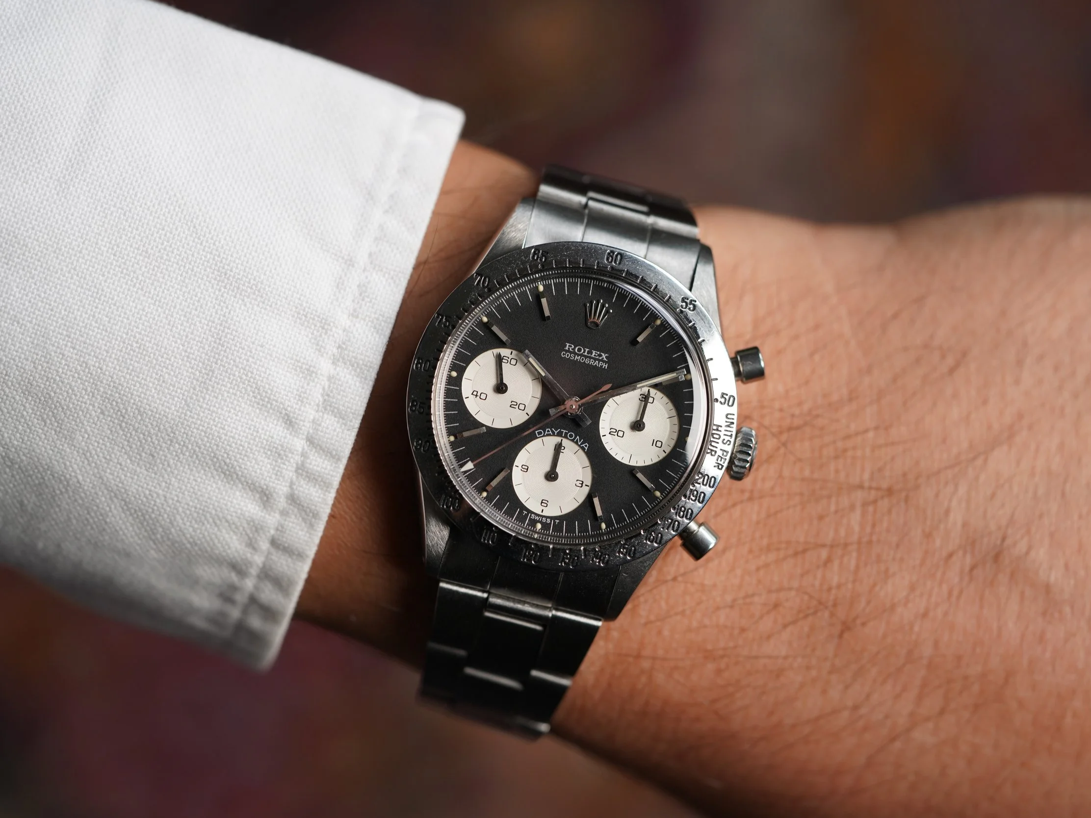
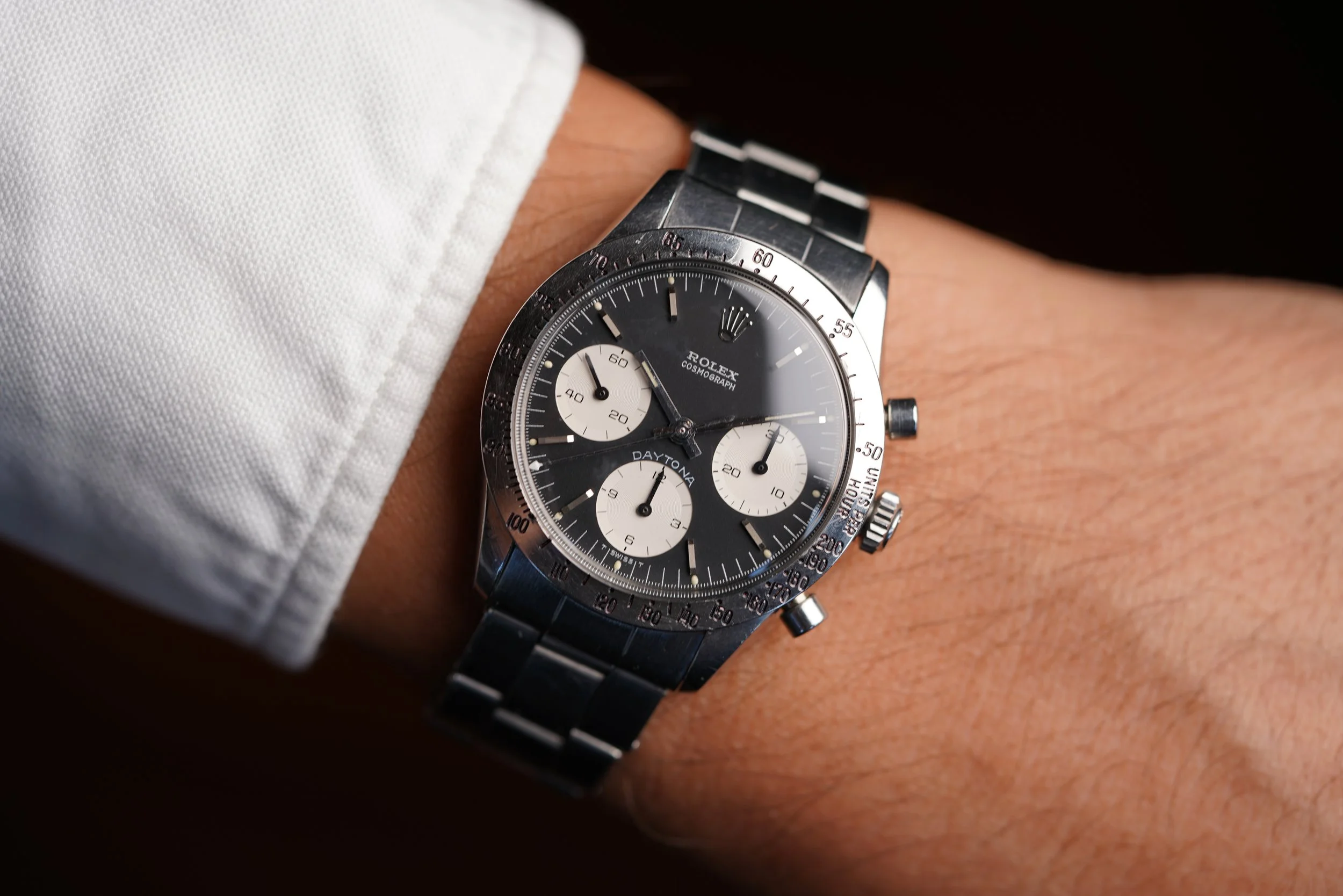
The most popular color of Daytona font is undoubtedly red, but collectors are often surprised to learn about one of the most underrated Rolex Daytona models: the “Blue” Daytona. This baby blue color font is found on the ‘DAYTONA” font on reference 6262s and late examples of the reference 6239. To make sense of the Rolex Daytona reference 6262, it is important to note that these are uncommon references. The Daytona reference 6262 was the shortest produced manual-wind Daytona period being introduced in circa 1970 and remaining in production through circa 1971, merely one year! The Rolex Daytona reference 6262 is defined by the steel bezel and pump pushers, but the reference 6262 (and reference 6263, 6264, and 6265) would also usher in the Valjoux 727 which was a higher-frequency manual-wind calibre upgraded from the Valjoux 72 in predecessor references 6269, 6240, and 6241.
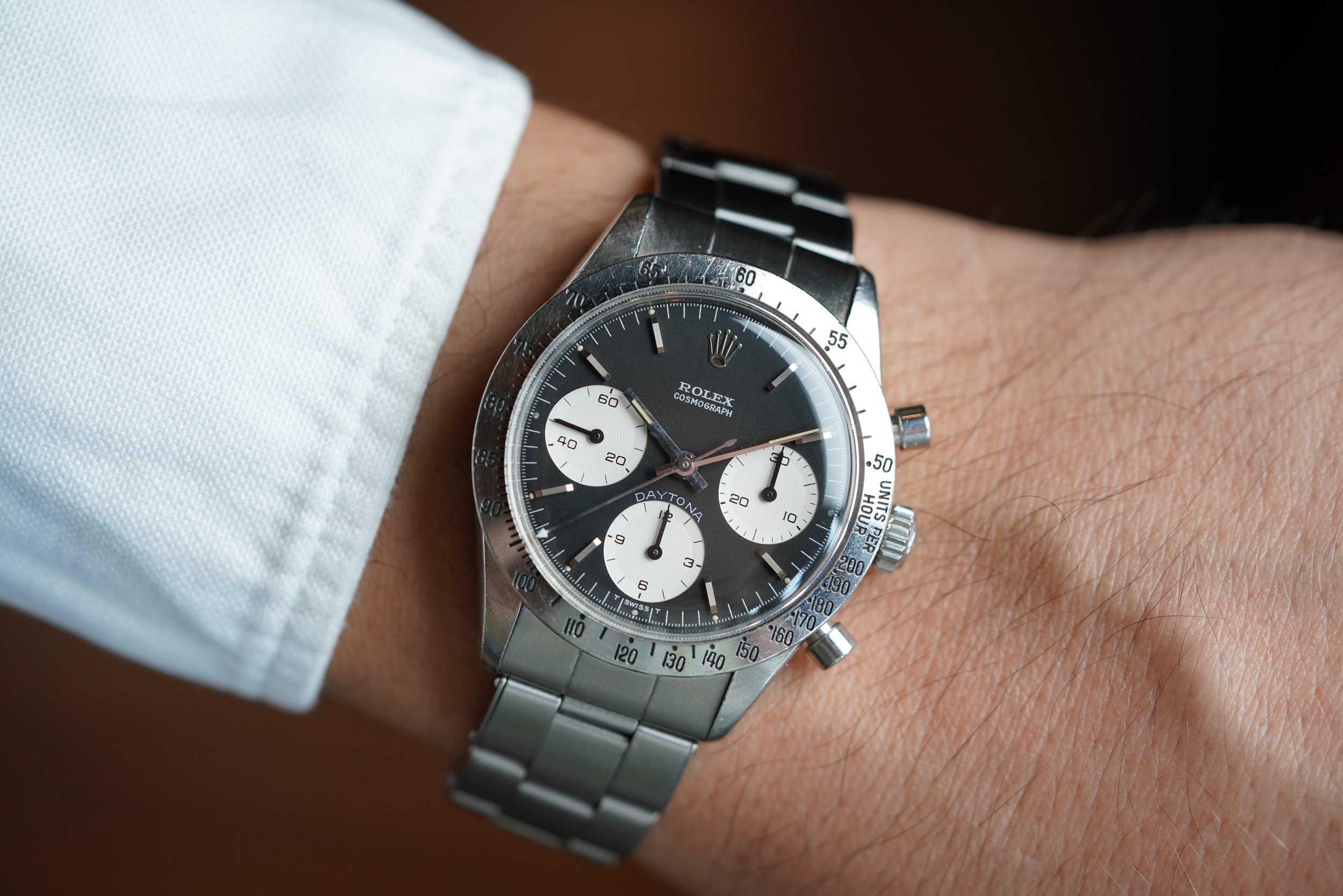
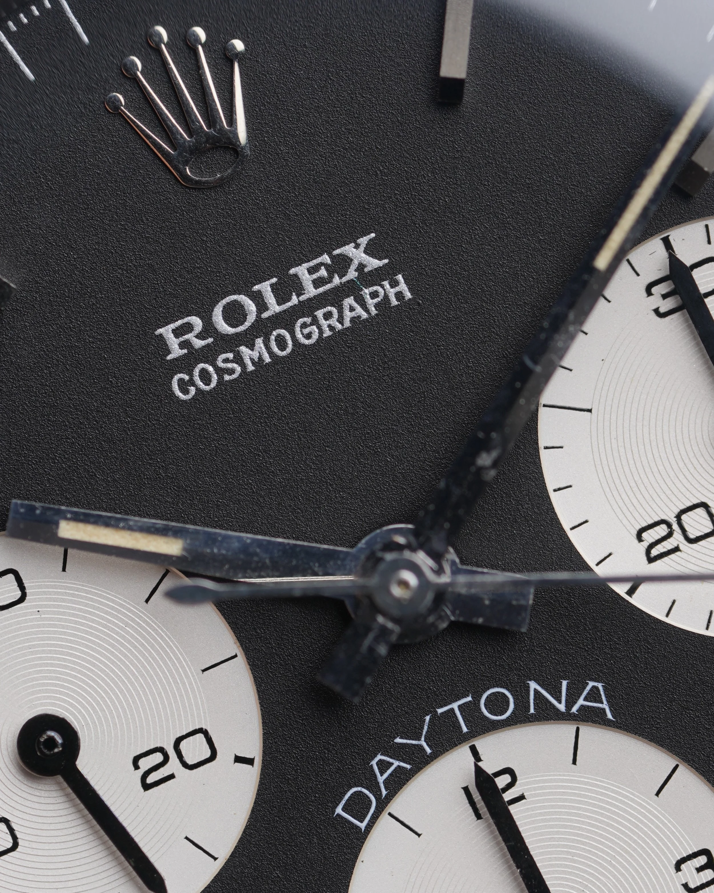
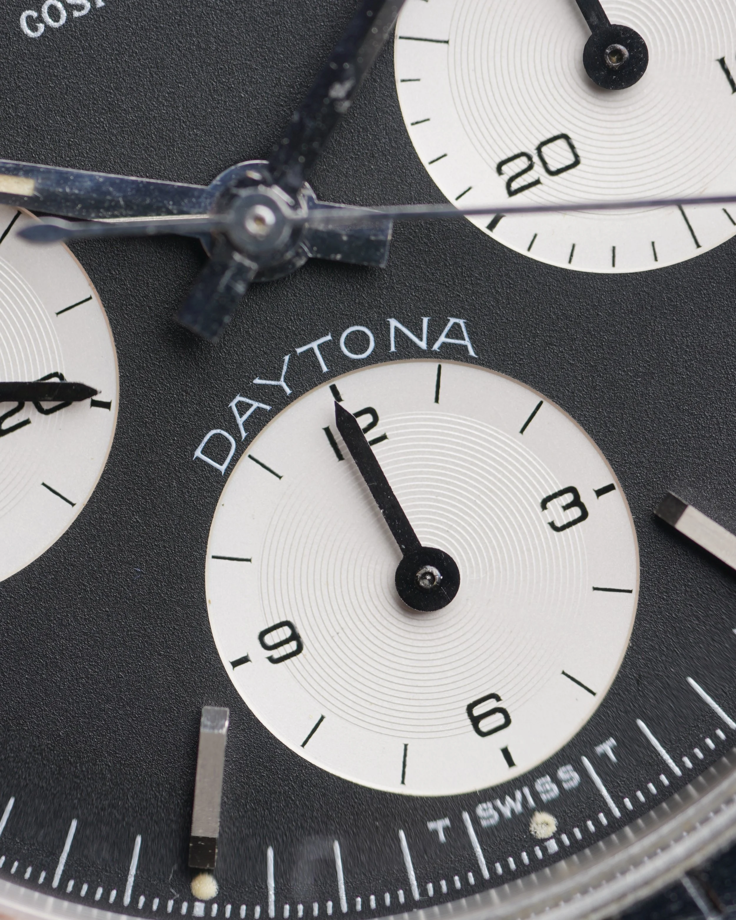
The Daytona reference 6262 comes in five variants - the first two being the Paul Newman Daytonas in both silver and black dials (Red “DAYTONA” font). The third being the silver sunburst dial (grey/black “DAYTONA” font). The fourth being the extremely rare gold 6262 with black dials and champagne subdials. The fifth variant being the black matte dials known as the “Blue” Daytonas.
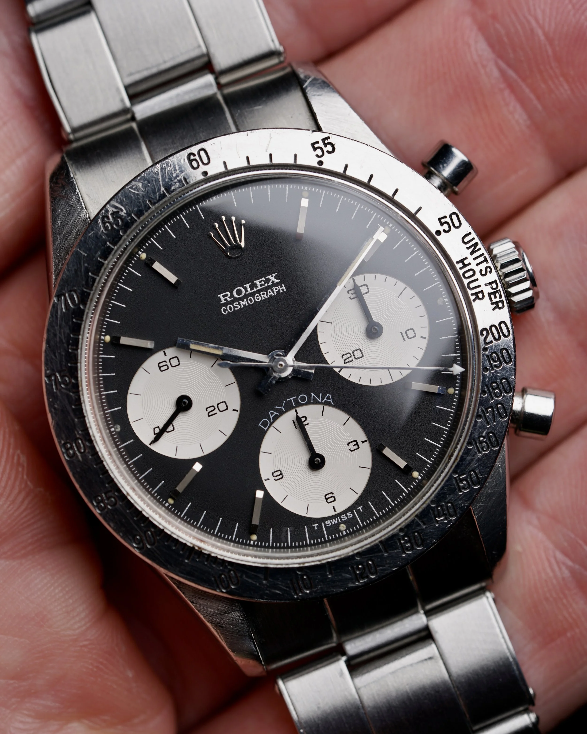
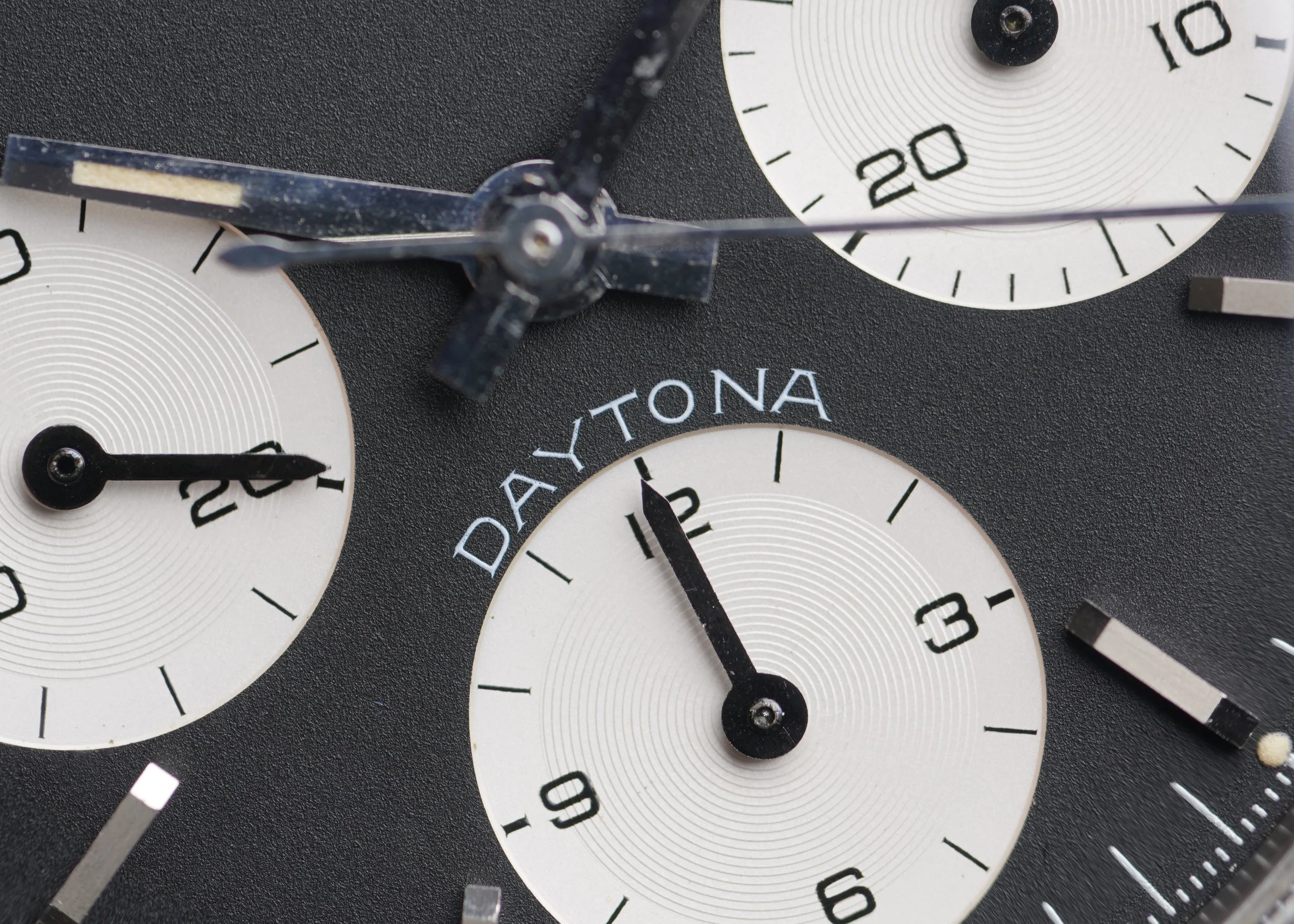
These examples feature a light blue “DAYTONA” font. Similar to the secondary stamping on Submariner reference 5512s, this color is slightly differs from the main text of the dial - in the 6262, the white “ROLEX COSMOGRAPH” font found below the coronet. Collectors love the “Blue” Daytona’s understated nature. It is a If you know, you know type of watch. The louder “Big Red” Daytona is certainly iconic, and the Paul Newman is the pinnacle. However, the “Blue” Daytonas are very similar to the stealthiness found in the cult-classic Carrera models. This dial variant is perhaps the closest comp to the classic Heuer Carrera reference 2447N and reference 2447NS in its minimalism. The contrasting outer track on a “Paul Newman” and numerals make for a more dynamic dial, whereas the the “Blue” Daytona is as pure as it gets. The font on these dials can be quite appealing in that the “ROLEX COSMOGRAPH” text has a subtle grey flakey texture that aligns with “T SWISS T” the demarcations on the outer dial. The light blue “DAYTONA” font is extremely sharp, but a subtle standout color making for a low-key flex. The “Blue” Daytona is a fantastic and rare chronograph worthy of discussion and worthy of any astute collection.